
.png)
Kitchen Mate aims to help users maintain a healthy lifestyle, improve their diet, and be mindful of the environmental impact of their food. Based on our study results, we decided to create an application with the following core features:
1. The application allows users to find healthy recipes by searching and filtering based on their food preferences. These preferences include any allergies / health conditions.
2. The application allows users to add their location(s) in order to help them search for nearby places where they can buy ingredients that are fresh, affordable, and environmentally friendly.
3. The application allows users to receive useful information about ways to manage waste in their household based on their own waste management preferences.
I worked in a team of 4 conducting user research and creating wireframes. I created the final high fidelity mock-up solo.
November 2022 - December 2022
Pen and Paper, Figma
To analyze the data gathered from semi-structured interviews and naturalistic observations, we firstly carried out affinity mapping to organize overlapping research findings into distinct clusters. We did this by recording notes from all observations and interviews on to sticky notes. We then identified notes that had relationships between them and placed them into groups. Opting for affinity mapping to analyze the qualitative data allowed us to unify large amount of data to understand user needs and define product requirements.
.png)
Due to the variation of data gathered from user research, which identified insights important for dieting and environmental impact of food, we also introduced aggregated empathy mapping. Aggregated empathy maps were chosen, as participants represented user segments, which split them into distinct groups based on shared behaviors and characteristics. From the aggregated empathy maps, we developed three different user groups where each user segment shared similar attitudes, behaviors, and goals. Based on the user research, aggregated empathy mapping identified the following user groups:
1) Users with busy schedules: This group of users regularly had busy schedules which prevented them from implementing healthy diets and expanding their knowledge on the environmental impact of food.
2) Users with health conditions: This group of users had health conditions which were impacted by their diet and lifestyle choices.
3) Users with financial constraints: This group of users considered the diet and the impact of their food waste to be vital.
.png)
.png)
.png)

Our persona 'Steve' represented users with busy schedules.
Our persona 'Javina' represented users who had a family to look after, and were managing their budget.

.jpg)
Our persona 'Anna' represented users with health conditions.
To represent scenarios of users’ decisions, pain points, and how they would achieve their goals, we conducted future user journeys of our personas. Mapping out future user journeys gave us opportunities for improvement, as well as direction in capturing user requirements and prioritizing features that the users required to complete their goals. We visualized the ideal future user journeys by displaying the user’s “Actions” which are the stages they go through from their pain point to achieving their goals. “Doing” was an explanation of what the users did in each action. “Thinking and Saying” were the user’s thoughts as they went through each action. “Feelings” were adjectives of how users felt during the actions. “Improvement Opportunities” consisted of our ideas about how to solve the user’s problem at every action. Pictures of emotions were used to express what users felt at every action.
We turned the scenarios we conducted in the user journeys, into visual presentations by drawing storyboards. These storyboards describe a fragment of the user journey and use images for better understanding and communication of user goals. The User Research, Data Analysis and Conceptual Design phases helped us ideate features that would be most useful for our users. It was time to translate these ideas into wireframes.


.png)


.png)
We started with brainstorming ideas by drawing wireframes that included content from our main ideas. The purpose of this stage was ‘to create the structure of the application, to communicate and map out the interface, its screen and basic content’. After creating low-fidelity wireframes on white board, we transitioned to creating medium fidelity wireframes in Figma. This tool allowed us to virtually collaborate and communicate ideas which was especially useful as we sometimes had time constraints for in-person meetings. Creating the medium-fidelity wireframes digitally also allowed us to include detailed information and capture the application’s features.
After completing our mid-fidelity wireframe screens in Figma, we used its prototyping feature to link the screens and create a mid-fidelity prototype. Our reasoning for creating a mid-fidelity prototype was because it would make user-testing more accurate in comparison to a low-fidelity prototype. Unlike a high-fidelity prototype where users might comment on superficial aspects such as colors, the mid-fidelity prototype would keep their focus on the design and core usability. It would also take less time to create compared to a high-fidelity prototype and would be easier to change.


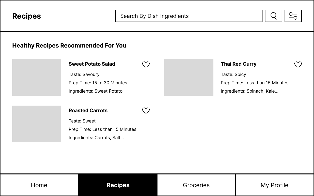
We wanted to make sure that users would be able to easily find the kinds of dishes they wanted even if they didn't yet have a dish in mind. We created this filter to allow KitchenMate to offer them recommendations.
It was important to us for users to be able to find their favorite dishes again or save them for later. To achieve this we added the ability to save dishes at any stage where they are visible.

An important feature we added to the 'Recipe' page was the option to add in waste management preferences. This allows KitchenMate to recommend waste management solutions to users while they're cooking. This feature was important as during our observations many participants were very busy while cooking, and during interviews some mentioned being too busy to worry about what exactly could be recycled.
Our participants had different amounts of outdoor space so we knew our users would too. To accommodate for different outdoor space sizes KitchenMate lets users specify exactly how much outdoor space they have.


Waste management was something that confused some participants in interviews so we decided to add a page explaining waste management possibilities to users.
Once preferences have been added to the 'Waste Management' section a list of recommendations that are easily visible to users is displayed on the 'Recipe' page.


We added a filter that lets users specify what locations they wanted to look for.
Users can see what shops are close to them and can click on them via the map for more information or scroll down to see what looks best.


It was important to provide the ability to find out how to get to the shops to help farther visualize how close or far the listed shops are.
Wile creating a new account users are given the option to add in preferences right away, as KitchenMate works best when it knows what to recommend to users.


The 'Homepage' features all of the main features on the app, the Recipes and Waste Management sections, and the ability to find shops close by. The 'My Profile' page is a quick way to edit saved preferences and filters.
.png)

We evaluated our prototype with four participants who were given several tasks and asked to explain their thought process while using the prototype. From this we came up with a list of improvements we hope to add.
1) Adding a video feature in the waste management section for the recipes page. This will allow users to get a better understanding of how to create food from waste.
2) Adding the days of the week for which the shops are open in the grocery page, so that users have more specific filtering options.
3) Providing additional information on how users can go to the shops on the map. For example, what bus lines you can take from their location.
4) Adding a visual aid to the slide bar in the grocery page, for example, digits of miles while sliding.
In the future I hope to create additional high fidelity wireframes as well as create a voice prototype. This would show a more complete display of what the app would be capable of.
.jpg)
.png)
.png)
Copyright © UIUXer | Designed by VictorFlow - Powered by Webflow
.png)

